By :
jm-dev
Published on Wednesday, December 13, 2017,09:34:43 in WordPress Plugins
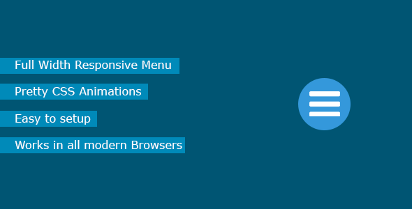
JM Responsive Menu is an easy to setup Mobile Menu for Wordpress.
Available Options
Mobile Breakpoint: The mobile Breakpoint is the width in px where the Responsive Menu becomes visible. You can choose a very high value if you want the menu to always be displayed.
Menu to use: Select one of your created Menus to be used for the responsive Menu. You can create a Menu under “Appearance”->”Menus”.
Menu to hide: Expectes a class or an id for the html element that contains the original menu, which will become invisible once the mobile breakpoint is reached.
Font Size and Line Height: Sets the font size and line height of the menu items.
Background Color and Background Opacity: Set the color and opacity of the background of the menu.
Burger Color: Sets the color of the responsive menu icon.
Burger Position: The position of the Burger-Menu.
Burger Margin: Margin of the Burger (top, right, bottom, left).
Font Color and Font Hover Color: Sets the Font and Hover color of the Menu Items.
Share This Product


